Shared Spaces - Reserve a Meeting Room at the Public Library
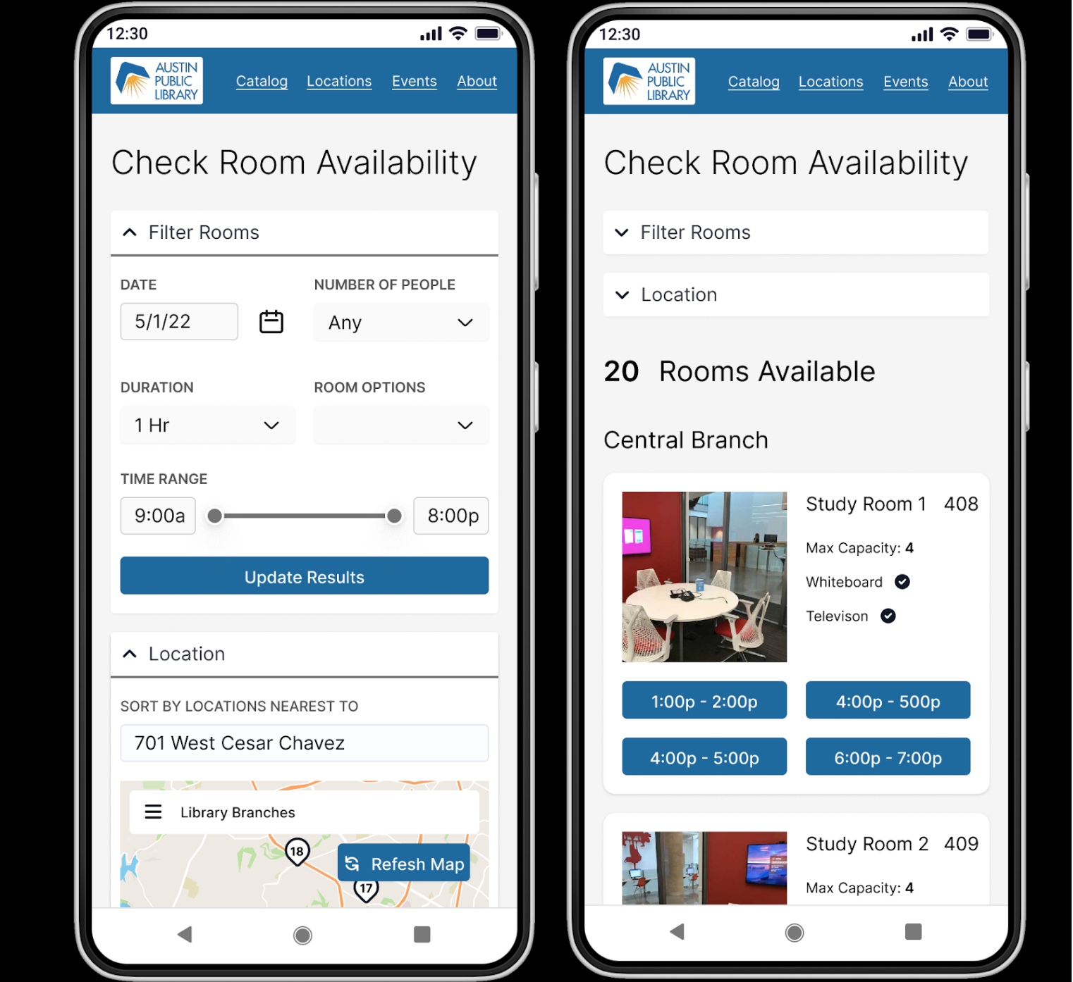
I designed a functioning prototype for a would-be open source application that allows library goers to check availability and reserve meeting rooms at their local library.
Vision Statement
Shared Spaces exists to allow library users to easily browse available meeting rooms and reserve a room that fits their needs. They should be able to quickly filter rooms that don’t fit their needs, find the library closest to them.
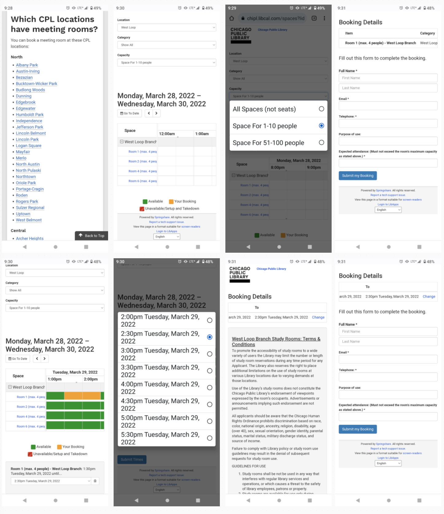
Currently, library goers have to wade through long lists of library branches and available rooms, often times not finding out that the room is not available at the time they want at the very end of the process. Often websites often fail accessibility standards and generally it’s difficult to find the room you need.
Shared Spaces was designed to improve the usability of reserving a room at the library for everyone by designing with accessibility in mind. It was designed to be used by any size library system, big or small.
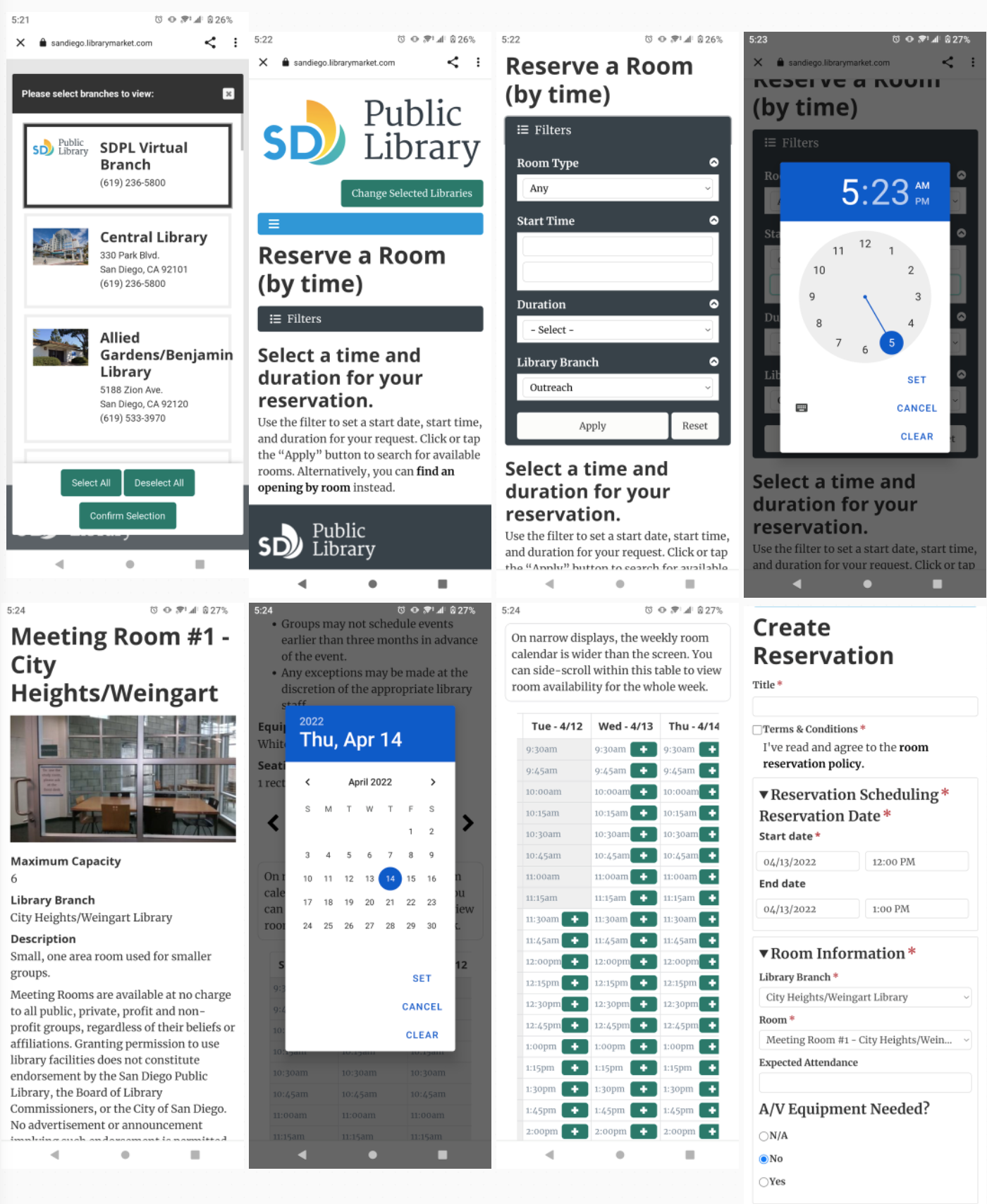
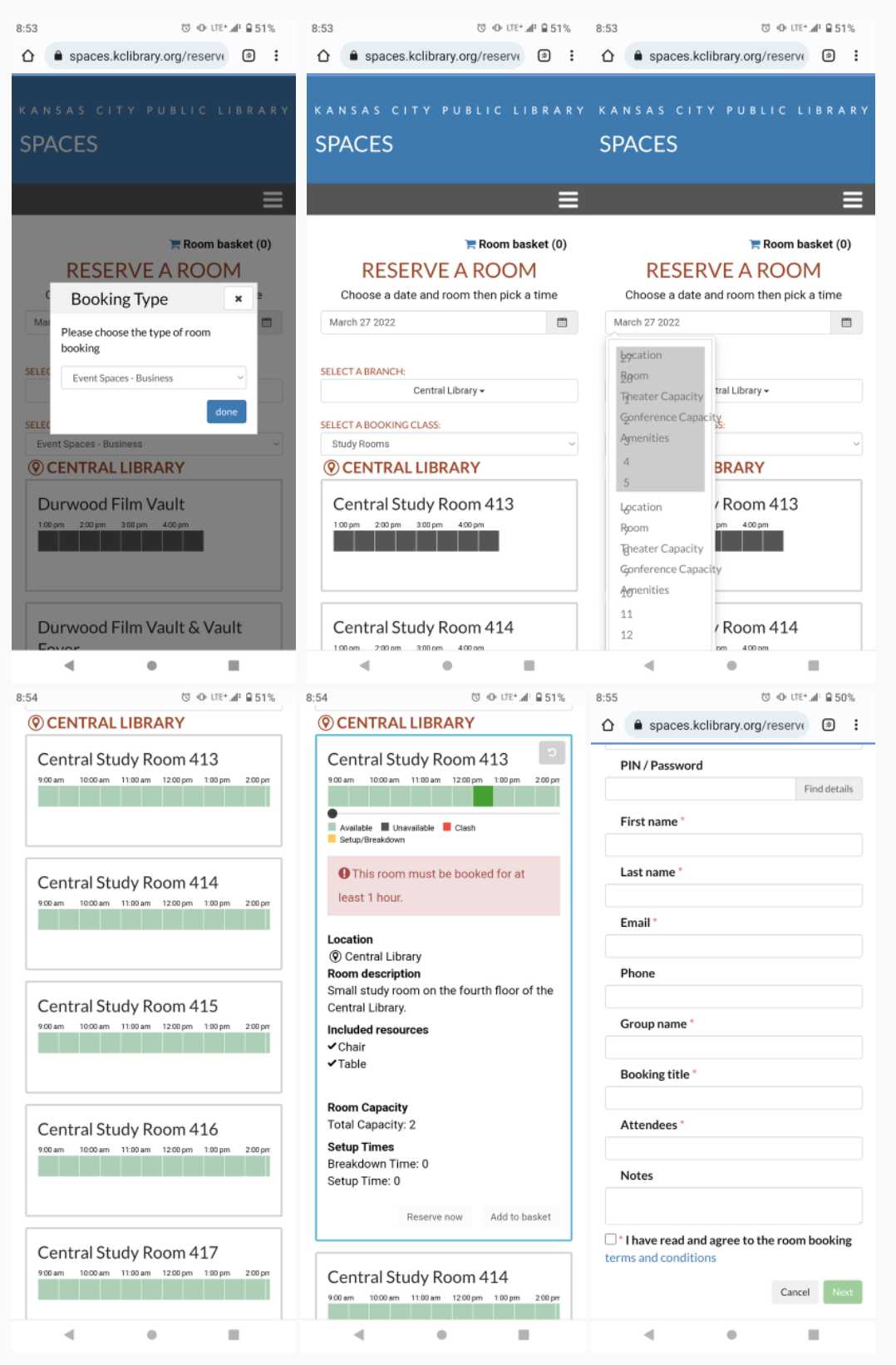
Competitive Analysis
Library Market
San Diego Public Library
Decmo Spaces
Kansas City Public Library
Springshare
Chicago Public Library
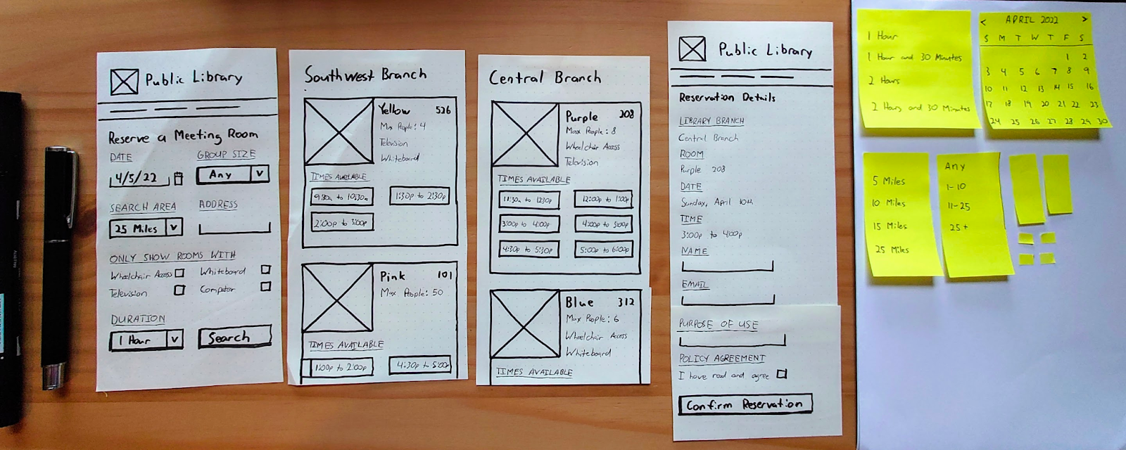
Paper Prototype and Concept Testing
I did two rounds of concept testing with a variety of people.
What I found
- People wanted a way to select a specific library
- People wanted to see a map of all the libraries that had available meeting rooms near them
- People were confused about the next step after filtering content
- People had different expectation for how the map worked
- People wanted a final confirmation page to confirm their appointment
High Fidelity Prototype and Usability Testing
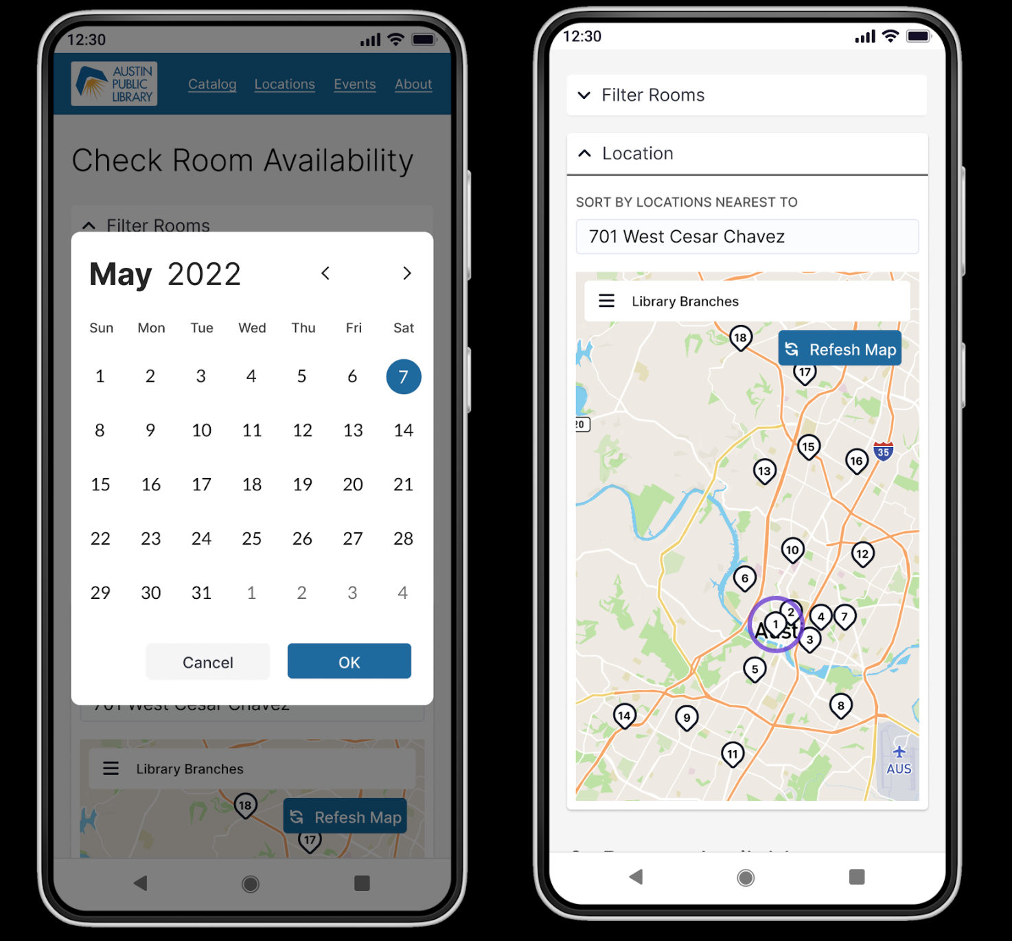
Taking what I learned I iterated on my designs and turned them into high fidelity prototypes in figma.
Goals:
- How do people explore which rooms are available?
- Do people feel comfortable filtering and sorting rooms?
- How do they expect the interactive map to work?
A/B test - rooms above the fold
Had little affect. People were just as likely to start by exploring rooms either way.
What I learned
I found a few areas to improve usability when opening the date picker, when they made selections in a dropdown, and by not repeating usability patterns when opening accordions.
If participants filtered too much and there weren’t any rooms available, they were confused and didn’t understand that they needed to widen their filter options.
People wanted to be able to search for the exact library they were looking for by name instead of by address.
Impact
I was mostly on the right track. People mostly were able to use the system as I intended. They understood how to filter to find the room they wanted and were able to check out in a matter of minutes.
